<post>
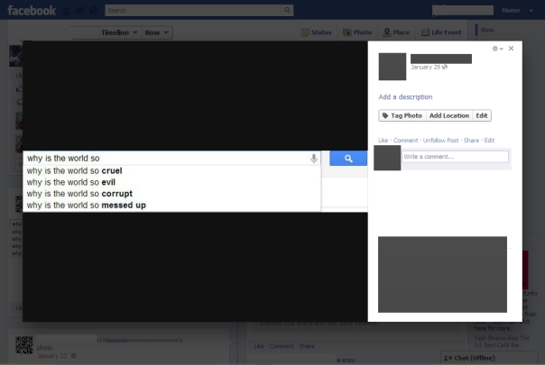
Facebook’s picture viewer got a new makeover yet again, with a striking back look (black was prevalent in the last-to-last picture viewer too). The comments section was shifted to the right along with the ads.
The Good : It has become sleeker, loads faster and has brought the comments section to the top, just like Google+’s picture viewer. Some details like a ‘Like’ button, a ‘Share’ button and ‘Wall Photos’ and of course, the ‘Previous’ and ‘Next’ button come up only when the user hovers over the picture, thus making it take up less space. The ads have also come up to the top. The user does not need to scroll down in order to Comment or Share.
The Bad : The photo has become smaller as compared to the previous photo viewer. Since the photo and comments come side-by-side, the photo does not get enough of emphasis. The picture viewer has not been able to give the photo the place it should get the way Google+ has done it.
Recommendations : The opacity could be removed from the back. The comments section should be given less priority than the picture. It could show up only when the user hovers over the picture, or it could be given a hiding functionality. The Share feature could get more space, it could be made up into a button. When hidden, random comments could show up somewhere.

</post>